.avif)

You're standing in a bathroom that's almost right. The tile works, the vanity is staying, the fixtures are already chosen, and yet the walls still feel unresolved, as if the room hasn't decided what it wants to be. That's usually where the right paint color does the quiet but essential work, especially in homes across Washington, DC, Maryland, and Virginia where bathrooms often need to coordinate with finished millwork, stone, metal, and lighting that aren't starting from scratch.
At Jennifer Gilmer Kitchen & Bath, the color conversation usually begins with the feeling a client wants every morning and every evening. A bathroom can read crisp, restful, refined, or softly expressive, depending on how the wall color plays with the materials already in place. For that reason, the best bathroom paint color ideas aren't just about trend. They're about the room's architecture, the quality of light, and how the finishes will live together over time.
paint color sheen tips from Hayes
Table of Contents
1. Soft Greige The Versatile Neutral
Soft greige has earned its place because it sits in the middle of a room's competing needs. It feels warmer than a cool gray, but it doesn't tip into beige-heavy territory, which makes it useful when a bathroom already includes marble, porcelain tile, or cabinetry with a visible wood tone. In a Maryland primary bath, greige can steady a busy material mix and keep polished nickel fixtures from looking overly formal.
Why designers keep returning to greige
Houzz's bathroom color reporting shows the broader market has moved away from gray-heavy palettes and toward brighter, more flexible neutrals, with white and off-white leading across multiple bathroom surfaces while gray declined from 38% in 2017 to 20% by 2023 for shower or nonshower walls (Houzz bathroom color trends). Soft greige fits that shift because it gives you the calm of a neutral without the chill that can make a bathroom feel flat. It also works well when the vanity, countertop, and wall color need to feel related instead of matched.
At Jennifer Gilmer Kitchen & Bath, greige often makes sense in rooms where the client wants longevity more than a dramatic statement. It's especially effective in transitional spaces, like a powder room that connects to a hallway with warmer trim, or a primary bath where stone veining needs room to breathe. A subtle greige can also bridge chrome hardware and warm wood cabinetry without making either side feel out of place.
Practical rule: if the bathroom already has strong material character, let greige be the quiet backdrop rather than the main event.
A few ways it earns its keep:
- Use it with white trim: The contrast stays crisp without becoming severe.
- Pair it with texture: Linen-look window treatments, honed stone, or a ribbed vanity panel keep the room from feeling one-note.
- Sample it in real light: Greige can drift warmer or cooler depending on the room's orientation and the bulb temperature.
2. Soft White with Warm Undertones
Soft white is often the smartest answer when a bathroom needs to feel clean, calm, and open without turning cold. The distinction matters. A crisp white can feel severe under bright vanity lighting, while a warmer white, sometimes read as ivory, cream, or off-white, softens the room and makes it more welcoming. In smaller baths and powder rooms, that warmth keeps the space from feeling like a utility room.
When white feels richer than color
The data supports this instinct. In Houzz's 2023 to 24 bathroom reporting, white remained the top wall color choice, and white accounted for 50% of countertop color preferences, while off-white held 20%, far ahead of gray at 9% (Houzz bathroom color trends). The same pattern shows up in broader bath trend research, where neutrals dominate and off-white leads at 58% in the NKBA and KBIS 2026 Bath Trends Report (NKBA 2026 Bath Trends Report). That makes warm white one of the safest choices when the goal is resale-friendly versatility.
In practice, warm white works beautifully in traditional bathrooms, especially when the room already has subway tile, paneled millwork, or polished brass. It also suits guest baths in older homes around Chevy Chase, where the architecture may benefit from something elegant but not overly decorative. Jennifer Gilmer Kitchen & Bath often uses this kind of white as a foundation, then layers texture through tile, wood, or wallcovering so the room doesn't flatten out.
Good white paint should disappear gracefully, not demand attention every time the vanity lights come on.
A thoughtful way to use it:
- Choose a warmer wall tone than the trim: That subtle shift adds depth.
- Keep ceiling paint slightly cleaner: It can help the room feel taller.
- Bring in texture: Matte tile, woven shades, or lightly grained wood keep the palette from feeling blank.
3. Muted Sage Green Nature-Inspired Calm
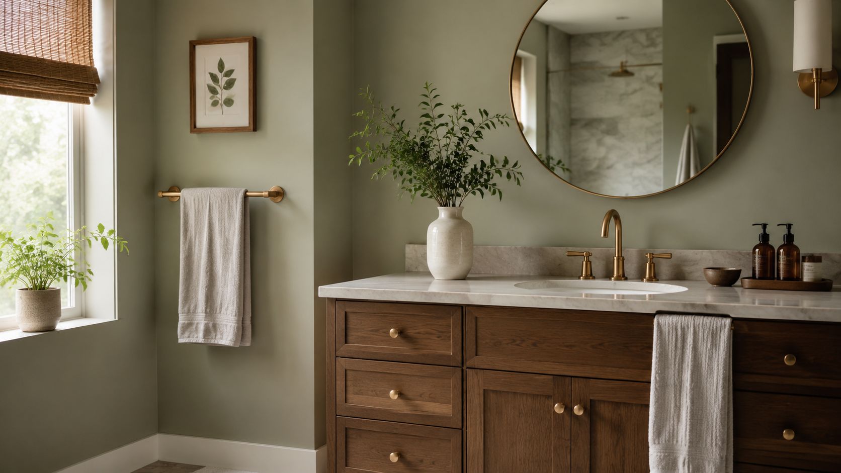
Muted sage is one of the easiest ways to bring life into a bathroom without pushing the space into overt color. It feels natural, composed, and a little more personal than white or greige, which is why so many clients respond to it when they want a room that feels restorative rather than clinical. In a primary bath, that can matter as much as the tile itself.
Sage works best when it stays restrained
The strongest market signal around “color” baths is still muted. The NKBA and KBIS 2026 Bath Trends Report found sage at 64% and olive at 43%, while neutrals remained the leading category overall (NKBA 2026 Bath Trends Report). That tells you something important. Homeowners do want color, but they want it softened, earthy, and believable in daily use.
Sage does its best work with warm wood, brass, or gold-toned hardware, and natural stone that has some movement but not too much contrast. In a Virginia guest bath, it can give the room interest while staying quiet enough for repeated use. In a Maryland primary suite, it can pair with walnut cabinetry and honed marble for a restful, tailored look.
The warning is simple. A sage that is too bright can feel decorative in the wrong way, and one that leans too gray can lose its sense of freshness. That's why Jennifer Gilmer Kitchen & Bath pays close attention to undertone, especially when the room already has a fixed tile or countertop. Matching sage to a bath isn't about chasing a pretty chip on the wall. It's about making sure the color belongs next to the materials that aren't changing.
Best pairings
- Warm metals: Brass or brushed gold keeps the palette grounded.
- Natural stone: Honed marble or limestone supports the earthy note.
- Wood cabinetry: Walnut and similar tones make sage feel intentional, not theme-driven.
4. Soft Gray-Blue Sophisticated and Calming
Soft gray-blue has a particular kind of restraint that suits primary bathrooms beautifully. It offers a little more character than a plain gray, but it stops short of obvious blue, which means it can read polished rather than playful. In rooms where the cabinetry is contemporary and the fixtures are sleek, gray-blue creates a composed backdrop that feels customized and calm.
A color that changes with the light
The reason this shade works so well is its middle-ground nature. Under daylight, it can feel airy and slightly aquatic. Under artificial light, it settles down and looks more grounded, which matters in bathrooms that are used early in the morning and late at night. That adaptability makes it a strong choice for homes with mixed lighting conditions, especially when the room doesn't have generous windows.
Search behavior suggests homeowners are not just browsing broad color families, they're looking for paint-specific bathroom solutions. In trend analysis from Accio, “bathroom paint colors” outperformed related terms and peaked at 92 in January 2025, then rebounded to 79 by June 2025 after an April dip to 62 (Accio bathroom color trends). That kind of search intent usually points to people making real decisions about finish, lighting, and compatibility, not collecting inspiration.
For a Northern Virginia primary bath, soft gray-blue can bring order to marble tile and polished nickel without feeling cold. For a transitional powder room, it can set off decorative wallcovering or patterned tile without competing with it. Jennifer Gilmer Kitchen & Bath often treats this color as a refined substitute for generic gray, especially when a client wants the room to feel quiet but not blank.
Test gray-blue against the actual tile, not beside a paint chip. The undertone that looks elegant on paper can look chilly next to the wrong stone.
5. Warm Taupe Sophisticated Earthiness
Warm taupe is a useful answer for homeowners who want a neutral with a little more depth. It has the softness of beige, but the gray modulation keeps it from feeling too rustic or too dated. In the right bathroom, it can make wood cabinetry, stone countertops, and metal fixtures feel like parts of one conversation rather than separate decisions.
The right taupe feels architectural
What makes taupe compelling is its ability to carry warmth without heaviness. That matters in bathrooms where natural materials are already doing a lot of work. A well-chosen taupe can support mahogany cabinetry in a traditional Maryland estate or give a Virginia bathroom a more refined presence when paired with contemporary fixtures.
The current bath-trend picture leans into this kind of warmth. The NKBA and KBIS 2026 report places light brown/tan at 54% and off-white at 58%, while darker choices like black and dark gray/slate sit much lower at 18% each (NKBA 2026 Bath Trends Report). Taupe lives in that warmer, resale-safe territory while still feeling more dimensional than a standard builder neutral.
For clients at Jennifer Gilmer Kitchen & Bath, taupe often becomes the answer when the bathroom needs to feel mature and calm, not trendy. It works especially well with brushed gold, satin brass, or warm wood tones. If the room includes a lot of stone movement, taupe can also help soften the visual noise and keep the room from feeling overdesigned.
What to watch
- Too little gray: The color can start to feel dated.
- Too little light contrast: The room can feel enclosed.
- Too much cool metal: The warmth can get lost, and the wall color may read flatter than expected.
6. Pale Blue-Gray Serene and Understated
Pale blue-gray is for clients who want the softness of color without the sense that the room is making a statement. It can feel almost atmospheric, especially in a bathroom with good daylight and simple, elegant finishes. The effect is gentle, not sugary, which is why it suits guest baths and primary baths alike.
How to keep a delicate color from disappearing
The challenge with pale blue-gray is not choosing it, it's supporting it. Because the color is so light, it needs a bit of contrast elsewhere in the room or it can look unfinished. White subway tile, a slightly deeper vanity finish, or more defined hardware can give the color the structure it needs.
Search data also suggests bathroom color planning remains highly active around the moments when people start projects. In Google Trends-based reporting, “bathroom wall paint” reached a normalized peak of 88 in January 2025, while “bathroom paint colors” peaked at 84 in March 2025 and “bathroom tile colors” stayed lower, with a peak of 20 in February 2025 (Accio bathroom wall paint trends). That separation is revealing. People are not just thinking about tile, they're focusing on the wall finish that will help the whole room feel complete.
In a Chevy Chase primary bath, pale blue-gray can keep a room with white tile and natural light feeling serene rather than stark. In a Virginia guest bath, it can soften the mood without moving into decorative color that might feel too personal. Jennifer Gilmer Kitchen & Bath often uses this kind of shade when the architecture calls for understatement and the materials need room to speak.
A useful approach:
- Pair it with off-white trim: The subtle contrast keeps the room airy.
- Use a slightly deeper vanity or stone edge: That anchors the softness.
- Add texture elsewhere: Linen, fluted tile, or brushed metal give the color something to play against.
7. Soft Blush or Mauve Gentle Warmth and Femininity
Soft blush and mauve are no longer confined to a dated decorative moment. Used well, they bring warmth, grace, and a little personality to a bathroom without turning childish or overly sweet. The key is restraint. A muted pink or mauve can feel surprisingly refined when it's balanced by stone, metal, and clean lines.
Why these colors work best in guest spaces
Powder rooms are often the right place for blush because they can carry a more expressive mood than a primary bath. A Maryland powder room with soft blush walls, white marble, and brass fixtures can feel polished and memorable without trying too hard. Mauve, with its cooler purple lean, can be a smart choice when the room includes cooler metals or a more contemporary tile pattern.
Search trends show that bathrooms are a major room category for color interest, with one analysis finding the bathroom was the most searched room for black at 362,600 annual Google searches, followed by white at 252,400 and green at 204,800. The same study said bathroom-related paint colors drew over 2.2 million worldwide Google searches in 2021 (Accio bathroom color trends). That search behavior helps explain why more expressive colors like blush and mauve keep resurfacing. Homeowners are looking for rooms that feel personal, not purely safe.
These shades need the right context. If the bathroom has heavy, yellowed lighting, blush can skew too warm. If the trim is stark and the fixtures are icy, mauve can feel disconnected. Jennifer Gilmer Kitchen & Bath usually steers these colors toward rooms where the fixtures, countertop, and hardware can support them gracefully.
Muted blush is best when it feels like part of the material palette, not a separate decorative layer.
8. Warm Black or Deep Charcoal Accent Wall Modern Sophistication
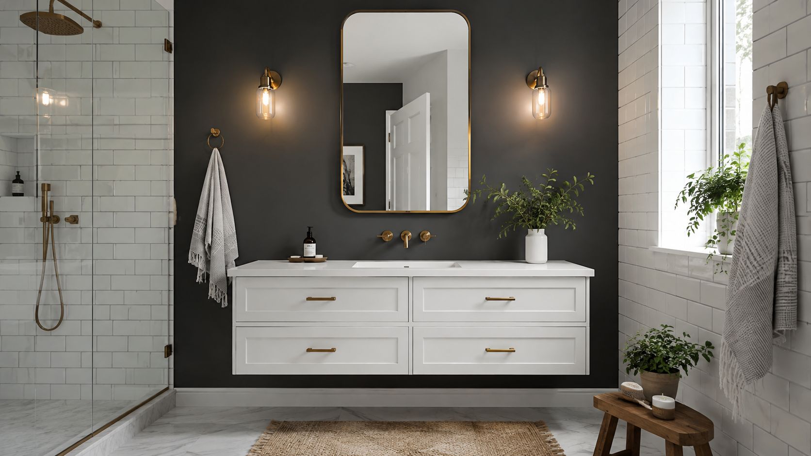
A dark bathroom wall can be compelling, but it needs discipline. The most successful version is usually a single accent wall in warm black or deep charcoal, placed where it can add depth without swallowing the room. Behind a vanity or opposite the entry, that darker surface can make a bathroom feel more architectural and intentional.
Darkness only works when the rest of the room stays light
High-end bathroom design is increasingly comfortable with deeper tones, but the trade-off is obvious. Dark walls can make a room feel dramatic, yet without enough light they can also make it feel enclosed. That's why the surrounding surfaces matter so much. White tile, pale countertops, and reflective fixture finishes keep the room usable and balanced.
In the same trend data that shows neutrals still dominate, dark brown registers at 30%, while black and dark gray/slate each sit at 18% in the NKBA and KBIS 2026 Bath Trends Report (NKBA 2026 Bath Trends Report). Those numbers suggest dark color is still a narrower choice, better used selectively than as a default. For a homeowner in Maryland or Northern Virginia who wants more drama, that usually means one wall, not four.
Lighting planning becomes important here. Jennifer Gilmer Kitchen & Bath pays close attention to vanity sconces, ceiling fixtures, and daylight when a client wants a charcoal or black wall. The firm's bathroom lighting design guidance pairs well with this kind of decision, because the right light can preserve depth while preventing the room from feeling dim.
A dark wall should look intentional in daylight and generous at night. If it doesn't do both, it needs rethinking.
The most effective version is often matte, not glossy. A flatter finish softens reflections and keeps the wall from looking harsh next to polished tile or metal. It's a refined move, but only when the rest of the room supports it with real brightness and clear contrast.
8-Option Bathroom Paint Color Comparison
| Color Option | 🔄 Implementation Complexity | ⚡ Resource Requirements | ⭐📊 Expected Outcomes | Ideal Use Cases | 💡 Key Advantages |
|---|---|---|---|---|---|
| Soft Greige: The Versatile Neutral | Low 🔄, standard paint; sample in-situ | Low ⚡, widely available paints | ⭐ High, warm, sophisticated; 📊 blends with many finishes | Primary & transitional baths with natural light | 💡 Versatile neutral; complements warm and cool elements |
| Soft White with Warm Undertones | Low 🔄, pick correct undertone; trim choices matter | Low ⚡, easy to source; quality trim paint recommended | ⭐ High, bright and inviting; 📊 enlarges small spaces | Powder rooms, secondary baths, low-light spaces | 💡 Luminous, universally flattering; pairs with any palette |
| Muted Sage Green: Nature-Inspired Calm | Moderate 🔄, choose desaturated tone; lighting-sensitive | Moderate ⚡, sample pots; coordinate with wood/metal | ⭐ High, calming, spa-like; 📊 adds subtle personality | Spa-like primaries; baths with natural stone and wood | 💡 Biophilic feel; pairs exceptionally with warm woods & brass |
| Soft Gray-Blue: Sophisticated and Calming | Moderate 🔄, balance blue/gray undertone; sample widely | Low–Moderate ⚡, standard paint; careful sampling advised | ⭐ High, refined and restorative; 📊 adapts to varied light | Modern primary bathrooms; transitional powder rooms | 💡 Subtle color that evokes water; pairs well with chrome & white tile |
| Warm Taupe: Sophisticated Earthiness | Moderate 🔄, tune brown/gray balance; test in room | Low–Moderate ⚡, common paints; coordinate with cabinetry | ⭐ High, earthy, inviting; 📊 adds depth without heaviness | Traditional/transitional baths; low-light spaces | 💡 Distinctive neutral; complements warm metals and wood |
| Pale Blue-Gray: Serene and Understated | Low–Moderate 🔄, very subtle; requires contrast planning | Low ⚡, standard paint; needs accent materials for balance | ⭐ Medium–High, serene, airy; 📊 expands perceived space | Small or north-facing bathrooms; tranquil primary baths | 💡 Airy backdrop; best with contrasting textures and deeper accents |
| Soft Blush or Mauve: Gentle Warmth and Femininity | Moderate 🔄, must be heavily desaturated; lighting-sensitive | Moderate ⚡, sample widely; coordinate with marble/brass | ⭐ Medium, refined warmth; 📊 introduces personality | Powder rooms, guest baths, traditional/transitional spaces | 💡 Subtle, elegant color; pairs with marble and warm gold/brass |
| Warm Black / Deep Charcoal Accent Wall | High 🔄, placement, finish and lighting critical | Moderate ⚡, accent-specific paint; good lighting fixtures needed | ⭐ High (if executed well), dramatic focal point; 📊 strong contrast impact | Accent behind vanity; contemporary primary baths | 💡 Creates high-contrast drama; highlights tile/fixtures and is reversible |
Begin Your Design Journey with Jennifer Gilmer Kitchen & Bath
Choosing a paint color is one of the most satisfying moments in a bathroom project because it ties the architecture, fixtures, and finishes into one coherent room. The right wall color doesn't compete with the vanity or tile. It lets them read with more clarity and gives the whole space a calmer, more finished presence.
At Jennifer Gilmer Kitchen & Bath, the process is shaped around that kind of restraint and precision. Jennifer Gilmer, CKD, Nancy McCarren, AIA, LEED AP, Marie-Josée Parisi, and the rest of the team work with clients throughout Washington, DC, Maryland, Virginia, and Delaware, guiding projects from concept through installation. That full-service approach matters in bathrooms, where color decisions are inseparable from lighting, storage, stone, and the practical realities of daily use.
Our showrooms in Chevy Chase, MD, Easton, MD, and Ashburn, VA give homeowners a place to compare materials, discuss undertones, and see how finishes live together in real space. For clients designing a primary bath, powder room, or guest bath, that hands-on process helps narrow the field to choices that feel personal and built to last. If you're ready to shape a bathroom around a palette that suits your home and your lifestyle, Jennifer Gilmer Kitchen & Bath is ready to help you begin.
Visit Jennifer Gilmer Kitchen & Bath to explore bathroom design support, material selections, and showroom consultations for your next project. If you're weighing bathroom paint color ideas against the tile, vanity, and lighting you already have, their team can help you make the room feel coordinated from the first sample to the final installation.