.avif)
You want a kitchen with personality, but you don't want to wake up five years from now feeling trapped by a color that overwhelms the room. That tension is familiar. A kitchen has to support cooking, storage, gathering, and everyday movement, while also belonging to the architecture and adjoining rooms.
The most successful colorful kitchen designs treat color as part of a complete strategy. Cabinet placement, work zones, durable finishes, material transitions, natural light, and layered lighting all influence whether a bold palette feels calm or chaotic. A colorful kitchen can be expressive without becoming visually noisy, provided the design team establishes structure before selecting the final hues.
The ideas below range from restrained two-tone cabinetry to more committed multicolor compositions. Jennifer Gilmer Kitchen & Bath guides homeowners through projects from concept through installation across Washington, DC, Maryland, and Virginia. Showroom visits in Chevy Chase, Easton, and Ashburn let clients evaluate cabinet finishes, countertop materials, hardware, and tile with real samples, rather than relying on small screens or isolated paint chips. Even details beyond the kitchen, such as decorating with indoor plants, can help connect a colorful room to the rest of the home.
Table of Contents
1. Two-Tone Cabinetry with Contrasting Upper and Lower Zones
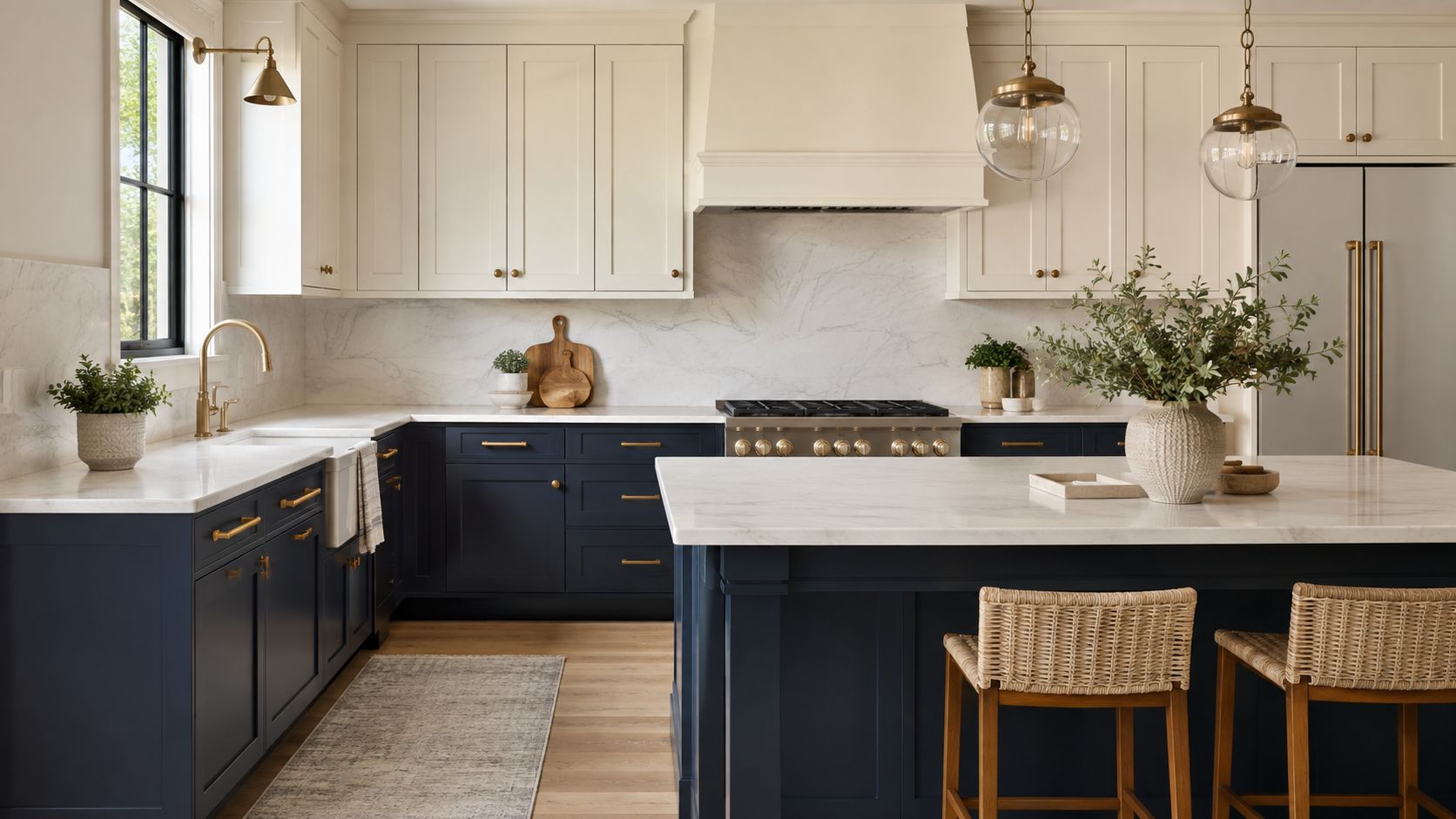
Two cabinet colors create an architectural division that feels deliberate rather than decorative. A deep navy or charcoal base can ground the cooking and cleanup zones, while cream, ivory, or pale gray cabinetry above keeps the upper portion of the room visually lighter. In an open-plan home, that shift can define the kitchen without closing it off from the dining or living area.
Consider navy lower cabinets with soft cream uppers, or warm sage bases with natural wood shelving above. A black base paired with pale blue uppers can feel contemporary, while white marble countertops provide a clean transition between the two zones. Keeping the door style consistent across both colors is important. Shaker fronts in one finish and ornate doors in another can make the palette feel accidental.
Put visual weight where it helps
The darker or more saturated color usually works best below eye level, where it anchors the room and disguises some of the daily marks that appear around drawers and work surfaces. In a kitchen with limited daylight, placing the darker finish on a wall of upper cabinets can make the room feel compressed, particularly if the ceiling is low.
Before choosing door colors, review how to choose kitchen cabinets, then visit Jennifer Gilmer Kitchen & Bath in Chevy Chase, Easton, or Ashburn to compare samples in natural light. Hardware must also relate to both finishes. Brushed brass, aged brass, and matte black can bridge contrasting cabinet colors, but the same metal should generally reappear in faucets or lighting.
Practical rule: Let cabinetry placement establish the color break. Don't use two colors simply because the combination looks appealing on a sample board.
2. Jewel-Tone Accent Cabinetry with Neutral Surrounding Elements
A jewel-toned cabinet color can act like a piece of artwork, especially when the surrounding materials stay quiet. Emerald green, sapphire blue, deep teal, and amethyst-inspired purple all have enough visual depth to anchor an island or an entire cabinet run. White marble, pale walls, light oak flooring, and restrained appliances give the saturated color room to breathe.
An emerald island with a white countertop and brass hardware offers a clear focal point without requiring every cabinet to carry the same intensity. Deep sapphire lower cabinets can work with honed marble and soft white walls, while moody teal can sit comfortably beside light gray concrete counters and stainless steel appliances. The best versions feel selected for the home and the client, not borrowed from a passing social media moment.
Keep the envelope calm
Neutral surrounding elements don't have to mean stark white. Creamy whites, warm taupes, pale stone, and light wood often support jewel tones more gracefully than a cold, high-contrast white. Current kitchen reporting points toward warmer and moodier palettes, including creamy whites, deeper brown stains, velvet-like taupes, rich purples, mahogany, and near-black greens, while also warning that loud trend-driven looks can begin to feel overdone. Elle Decor's 2026 kitchen color coverage is useful context for choosing depth without chasing novelty.
Finish quality matters because a jewel tone depends on consistent color and sheen. Ask the cabinetry supplier for a custom color match and view it beside the selected countertop, backsplash, and floor. Under-cabinet lighting should illuminate the work surface without creating dark bands across the doors. Ambient light, decorative pendants, and daylight each reveal different undertones, so selections shouldn't be made under one light source.
3. Rainbow or Multi-Color Cabinetry with Individual Painted Doors
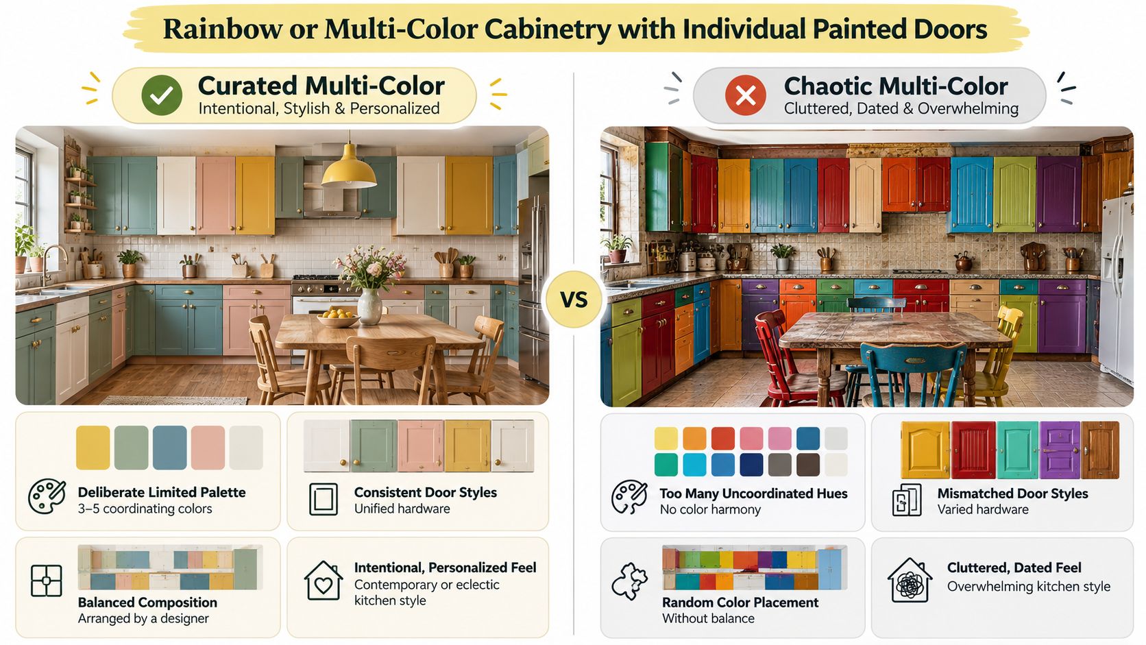
Individual painted doors can make a kitchen feel collected, playful, and highly personal. Soft blush, sage, butter yellow, and sky blue work well together when they share a similar level of saturation. A more dramatic composition might use charcoal, cream, and soft terracotta across a run of contemporary doors, with the pattern arranged to create visual balance rather than random variation.
This approach asks more of the designer than a single cabinet color does. Every door contributes to the composition, so the refrigerator panel, pantry fronts, island drawers, and open shelving need to be considered as part of the whole. In an open-concept room, the colors should also relate to furniture, artwork, flooring, and nearby architectural details.
Limit the palette and repeat the structure
A practical starting point is three or five colors, following guidance attributed to interior designer Greg Natale in a Livingetc feature on colorful kitchens. One hue can dominate while the remaining colors act as secondary and accent notes. The same source emphasizes natural textures and strong daylight or artificial lighting, both of which help bold cabinet finishes remain readable throughout the day.
Use one door style and one hardware language to keep the arrangement from becoming theatrical. A consistent slab or Shaker profile gives the eye a repeated rhythm, while a carefully planned color gradient can guide attention across the room. Matte finishes generally make multiple colors easier to live with than highly reflective surfaces, which can multiply highlights and make the pattern feel busier.
This design suits clients who see the kitchen as an expression of personality and accept that a more committed palette may need refreshing later. It isn't the safest choice for every resale-minded remodel, but it can be exceptionally appropriate in a family home, creative residence, or eclectic historic property.
A coordinated palette is easier to evaluate when you can see the doors together rather than one sample at a time. The following video offers another visual reference for thinking about color relationships and cabinet composition.
4. Warm, Saturated Earth Tones with Natural Material Integration
Terracotta, ochre, warm clay, burnt sienna, and warm charcoal bring color into the kitchen through materials that already feel connected to the earth. These hues are especially effective when paired with visible wood grain, natural stone, aged metal, and architectural details. Rather than asking the cabinetry to be the only source of interest, the design builds a complete material story.
A terracotta cabinet finish with honed travertine, wide-plank oak flooring, and oil-rubbed bronze hardware can suit a traditional or transitional home. Deep warm gray works with honey-toned shelves, slate counters, and aged brass. Ochre cabinetry can become more settled beside reclaimed wood, cream limestone, and wrought iron details.
This approach is particularly comfortable in historic neighborhoods across Washington, DC, Maryland, and Virginia, where kitchens often need to acknowledge existing trim, masonry, floors, or ceiling beams. The color should support those elements rather than compete with them.
Let texture temper saturation
Natural materials prevent saturated cabinetry from looking overly polished or theme-driven. A honed surface absorbs light differently from a glossy one, and wood adds variation that a flat painted wall cannot provide. Some stones and metals also develop patina, which can make the room feel more established over time.
View cabinet samples beside the proposed countertop and flooring, not against a white backdrop. Check the combination in daylight and under the planned fixtures. For earth tones, warmer lighting can support the palette. The plan calls for 2700K lighting to enhance the warmth of the cabinetry, but the final lighting specification should still account for task visibility and the color of nearby surfaces.
A colorful kitchen feels lasting when the cabinet finish belongs to the stone, wood, metal, and architecture around it.
5. Bold Matte Black or Charcoal Cabinetry with Metallic Accents
Matte black and charcoal cabinetry can give a kitchen clear definition, especially when the room includes pale marble, a light backsplash, or warm wood. The finish absorbs reflections, so it feels quieter than gloss and can suit both contemporary and transitional homes. In Washington, DC, Maryland, and Virginia, check the cabinet color against existing trim, flooring, and masonry before committing. A dark palette should relate to the architecture, not contrast with it.
Cabinet placement controls how heavy the color feels. A full black cabinet wall works with white tile and brushed brass, while deep charcoal can soften the combination of gray concrete counters, polished chrome, and a restrained black tile accent. Black lowers with open shelving or lighter uppers preserve visual openness and keep the darkest finish closer to the floor.
Light the dark surfaces deliberately
Dark cabinetry requires layered lighting. Under-cabinet fixtures should cover the worktops without creating glare, while ceiling lighting keeps corners legible. Pendants over an island add a decorative layer, define the central work zone, and connect it visually to the surrounding cabinets.
Material transitions also affect the result. Warm countertops, wood shelving, aged brass, natural stone, and woven seating add surface variation without weakening the contrast. Matte black hardware keeps the composition close to monochromatic, while brushed brass or polished chrome creates a stronger focal detail. Review kitchen cabinet hardware styles with the faucet, pendants, appliances, and door finish, since repeated pulls and knobs influence a long cabinet run.
For homeowners considering a paint-based refresh before replacing cabinets, Resene and Dulux cabinet painting can provide useful context for comparing finish durability and project cost.
Use black selectively in rooms with limited daylight or extensive upper storage. Restricting it to an island or lower cabinets can retain depth while keeping the kitchen practical and visually balanced. Sample the finish beside the countertop and flooring, then inspect it in daylight and under the planned fixtures before ordering.
6. Soft Pastels and Vintage-Inspired Color Combinations
Soft sage, dusty rose, pale blue, and creamy butter yellow can give a kitchen a welcoming, slightly nostalgic quality. The palette works particularly well with original woodwork, vintage tile, cottage proportions, or period architecture. Contemporary appliances and carefully planned storage keep the room practical, while the colors and hardware provide a sense of history.
Dusty sage cabinetry with cream butcher block, open wood shelving, and vintage brass creates a relaxed composition. Powder blue lower cabinets can sit beneath white uppers with a pale gray tile backsplash. Creamy yellow cabinetry gains structure from natural wood accents, white marble, and tile details that feel appropriate to the home's era.
Make nostalgia feel intentional
The finish should support the reference. A matte or subtly sheened cabinet surface usually feels more authentic than high-gloss lacquer in a vintage-inspired room. That doesn't mean every element needs to look old. Reproduction fixtures, contemporary lighting, and modern storage can coexist with period-appropriate tile if the proportions and materials share a common language.
Open shelving is useful here, but it shouldn't replace storage that the household depends on. Use it for dishes, glassware, or objects that contribute to the palette, while keeping less decorative equipment behind doors. Natural wood on shelves, beams, or flooring anchors pale colors and prevents the room from becoming overly sweet.
A client with an older Maryland home might use the existing floor or trim as the starting point, then select a cabinet color that echoes rather than copies those tones. That approach gives the kitchen character without turning it into a reproduction.
7. Vibrant Accent Walls or Backsplash Colors with Neutral Cabinetry
A colorful backsplash or accent wall offers a lower-commitment way to bring energy into the kitchen. Neutral cabinetry remains adaptable, while tile, paint, or the interior of open shelving carries the more expressive note. This is useful for homeowners who want personality but aren't ready to commit every cabinet door to a saturated finish.
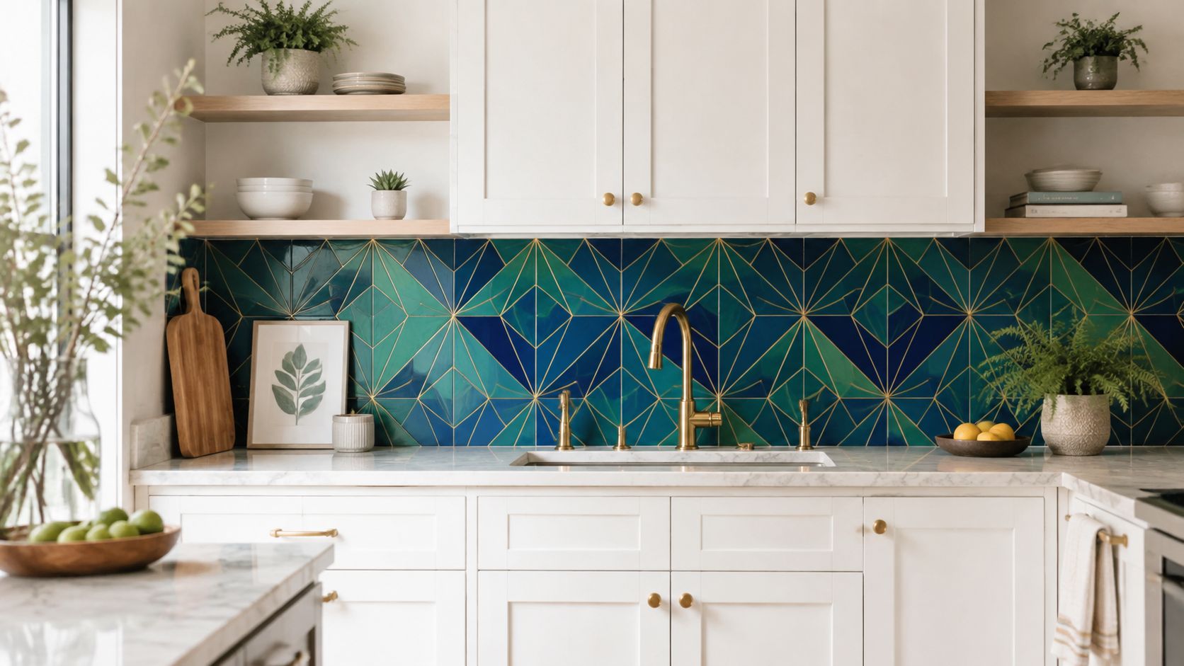
White cabinetry with geometric tile in emerald, sapphire, and gold can create a focal point behind the range. Cream cabinets may work with a terracotta or dusty rose wall behind open shelving. Light gray cabinetry can provide a quiet frame for Moroccan or Spanish-inspired tile in blues, greens, and earth tones.
Match the accent to the working parts
The accent color should appear elsewhere in a restrained way. A blue tile might relate to counter stools or a painted pantry interior. Brass in the tile can connect to the faucet and cabinet hardware. This repetition makes the backsplash feel designed into the room rather than added after the cabinets were chosen.
Pattern deserves equal attention. A busy geometric tile needs simpler counters and cabinet fronts, while a highly veined stone backsplash may call for a quieter painted wall. The backsplash should also be evaluated from the main sightlines into the room, particularly when the kitchen opens toward a dining area or family room.
Read kitchen backsplash design guidance before selecting a pattern, then view full tile boards in the kitchen's actual lighting. Small samples can hide variation in scale, grout color, and surface texture. Neutral cabinetry doesn't make a backsplash decision insignificant. It makes the backsplash more visible.
8. Soft Greens and Blues with Mixed Material Cabinetry
Soft greens and blues bring a natural reference into the kitchen without demanding the intensity of a jewel tone. Celadon, sage, seafoam, and powder blue can feel calm beside pale stone, light oak, and brushed metal. Mixed cabinetry adds depth, particularly when painted lower cabinets are combined with open wood shelving, glass-front uppers, or natural wood panels.
A sage lower run with honey-toned wood shelves, glass-front uppers, light marble, and brushed brass suits a kitchen overlooking a garden. Pale celadon cabinetry can work with light oak accents and a soft blue tile backsplash. Seafoam lower cabinets paired with floating wood shelves and white subway tile create a lighter, more informal composition.
Coordinate undertones before finishes
Greens and blues can shift noticeably according to daylight, orientation, nearby foliage, and adjoining wall colors. Compare cabinet samples with the actual wood species and finish. Honey oak, whitewashed wood, and natural walnut each produce a different relationship with a soft painted color, even when the paint sample appears unchanged.
Mixed materials should repeat with purpose. If the shelves introduce walnut, a stool, trim detail, or decorative object can echo that tone. If brass appears on the hardware, use it again in the lighting or faucet. Repetition keeps the room from becoming a collection of unrelated samples.
The National Kitchen and Bath Association's 2026 report places greens and blues behind neutrals in its color planning findings, with greens at 86% and blues at 78%, while neutrals lead at 96%. The published report supports a practical reading of the market: nature-based color remains widely acceptable, but most homeowners still use a neutral foundation.
North-facing or naturally bright rooms can both benefit from soft colors, but the undertones need testing. A showroom consultation makes it easier to compare painted doors, wood samples, tile, and hardware as one composition.
8 Colorful Kitchen Styles Compared
| Design Option | Complexity 🔄 | Resources & Maintenance ⚡ | Results / Impact 📊 | Ideal Use Cases 💡 | Key Advantages ⭐ |
|---|---|---|---|---|---|
| Two-Tone Cabinetry with Contrasting Upper and Lower Zones | Medium, color coordination and finish consistency required | Moderate, custom paint/finishes; standard maintenance | Balanced, sophisticated zoning; strong visual hierarchy | Open-plan, transitional or traditional homes seeking subtle color | Adds personality without full commitment; flexible accents |
| Jewel-Tone Accent Cabinetry with Neutral Surrounding Elements | Medium, precise color selection and lighting review | High, premium finishes, lighting to showcase color; shows dust | Luxury focal point that photographs well and ages gracefully | High-end or curated kitchens where color is the main statement | Rich depth and timelessness; simple neutral coordination |
| Rainbow / Multi-Color Cabinetry with Individual Painted Doors | High, designer orchestration needed to avoid chaos | Moderate–High, many painted surfaces; potential for periodic refresh | Highly personalized and memorable; risk of appearing cluttered if unmanaged | Eclectic or contemporary clients who want expressive, changeable design | Extremely customizable; individual doors can be updated easily |
| Warm, Saturated Earth Tones with Natural Material Integration | Medium, careful material-first specification | High, natural stone/wood materials and finish quality; maintenance for patina | Timeless, warm, collected aesthetic that integrates with architecture | Historic or material-driven homes seeking enduring warmth | Material richness; ages gracefully; coordinates with existing architecture |
| Bold Matte Black or Charcoal Cabinetry with Metallic Accents | Medium, lighting and contrast planning critical | Moderate, matte finishes, enhanced lighting, more frequent cleaning | Dramatic, gallery-like backdrop with strong contrast | Urban or transitional kitchens aiming for contemporary drama | Strong statement; pairs well with many countertop materials; enduring look |
| Soft Pastels and Vintage-Inspired Color Combinations | Low–Medium, finish selection to feel authentic | Moderate, period-appropriate hardware and finishes; careful upkeep | Warm, nostalgic, and approachable; can feel timeless when done well | Historic, cottage, or farmhouse kitchens restoring period character | Inviting, collected feel; easy to mix vintage and modern elements |
| Vibrant Accent Walls or Backsplash Colors with Neutral Cabinetry | Low, fewer changes to cabinetry; tile/paint coordination | Low–Moderate, replaceable tile or paint; lower cost and commitment | Focused color impact; flexible and easily updated | Clients uncertain about bold cabinetry or prioritizing resale flexibility | Low cost/commitment; pattern and color flexibility; easy to refresh |
| Soft Greens and Blues with Mixed Material Cabinetry | Medium–High, undertone and material coordination required | Moderate–High, mixed materials (paint, wood, glass); precise samples | Calm, layered, nature-connected result with visual depth | Kitchens with garden views or those seeking a soothing palette | Timeless, soothing colors; texture and depth from mixed materials |
Turn a Favorite Palette into a Workable Plan
Choosing a colorful kitchen begins with deciding how much commitment feels right. A backsplash or painted accent wall is easier to revise than a full run of jewel-toned cabinetry. A colored island offers a middle path, while two-tone cabinetry establishes a stronger architectural identity without requiring every surface to carry a bold hue. Multicolor doors demand the most coordination and the clearest willingness to live with a highly personal composition.
Start with the parts that won't move easily. Confirm the kitchen's circulation, appliance placement, pantry needs, and work zones before treating color as the main decision. A Remodelista before-and-after project involving a Portland Victorian kitchen and bath used a Barragán-inspired palette alongside layout modernization and coordination with adjacent rooms. The lesson is practical. Color works best after storage, movement, fixtures, and room relationships have been resolved, not as a substitute for them. The colorful kitchen coverage provides useful visual context for that integrated approach.
Then test the palette under real conditions. Cabinet doors, tile, countertop pieces, flooring, and hardware should be reviewed together in morning light, afternoon light, and the planned artificial lighting. A color that feels balanced beside a small white sample may appear unexpectedly cool or muddy beside a stone with a strong undertone. Natural textures and layered illumination help bold finishes remain legible rather than flat, especially in rooms where daylight changes across the day.
The broader market also favors restraint in the background. In the 2026 U.S. Houzz Kitchen Trends Study, wood is identified as the most popular cabinet color in renovated kitchens at 29%, while off-white leads wall colors at 29%, white follows at 21%, and wood tones lead flooring colors at 49%. The study summary shows why a colorful kitchen often benefits from a grounded envelope. Expressive cabinetry has more staying power when counters, walls, and floors don't compete with it.
Design decision: Choose the color element according to how often you're comfortable revisiting it, then spend the larger planning effort on layout, storage, lighting, and durable materials.
Jennifer Gilmer Kitchen & Bath helps homeowners in Washington, DC, Maryland, and Virginia develop that complete plan from concept through installation. The firm's process can include layout planning, custom or semi-custom cabinetry, integrated storage, appliance placement, lighting, hardware, countertop, backsplash, and finish selections. Showroom visits in Chevy Chase, Easton, and Ashburn give clients a place to compare real materials and see how different combinations work together.
For a colorful kitchen to feel current years from now, choose a palette you can live with, relate it to the home's architecture, and avoid treating trend coverage as a specification. Warm neutrals and earth tones are receiving strong attention as white and gray lose some of their former dominance, according to recent kitchen design trend reporting, but your home's light, floor, trim, and adjoining rooms matter more than a market direction. A well-planned kitchen should reflect the people who use it while remaining comfortable to inhabit and maintain.
Visit a Jennifer Gilmer Kitchen & Bath showroom with your floor plan, inspiration images, and any existing material samples. Seeing the options together is the most reliable way to decide whether your favorite colorful kitchen design belongs on the island, the backsplash, the full cabinet run, or a smaller architectural accent.
Jennifer Gilmer Kitchen & Bath offers full-service kitchen design and remodeling, including cabinetry, space planning, storage, lighting, materials, and installation coordination for homes across Washington, DC, Maryland, and Virginia. Visit Jennifer Gilmer Kitchen & Bath to explore project inspiration, learn about the showrooms in Chevy Chase, Easton, and Ashburn, and schedule a consultation for your colorful kitchen remodel.