.avif)

What makes a cabinet color work in one kitchen and feel completely wrong in another? The answer usually isn't the paint name. It's the relationship between the cabinets, natural and supplemental light, existing countertops, backsplash materials, hardware, architectural character, and the atmosphere you want the room to create.
The best paint color ideas for kitchen cabinets begin with the kitchen you want to live in. A soft white may let marble and lighting lead the composition, while navy, green, greige, or charcoal can give the room a stronger architectural presence. Two-tone combinations add another layer, but they only succeed when the island, perimeter cabinetry, flooring, and adjacent rooms feel intentionally connected.
This roundup moves from versatile whites through navy, green, greige, charcoal, and refined two-tone possibilities. If you're planning a kitchen in Washington, DC, Maryland, or Virginia, Jennifer Gilmer Kitchen & Bath can help you compare selections in a showroom and carry the project from concept through installation. For another perspective on how regional daylight affects cabinet decisions, compare these ideas with guidance on cabinet colours and Dublin light.
Table of Contents
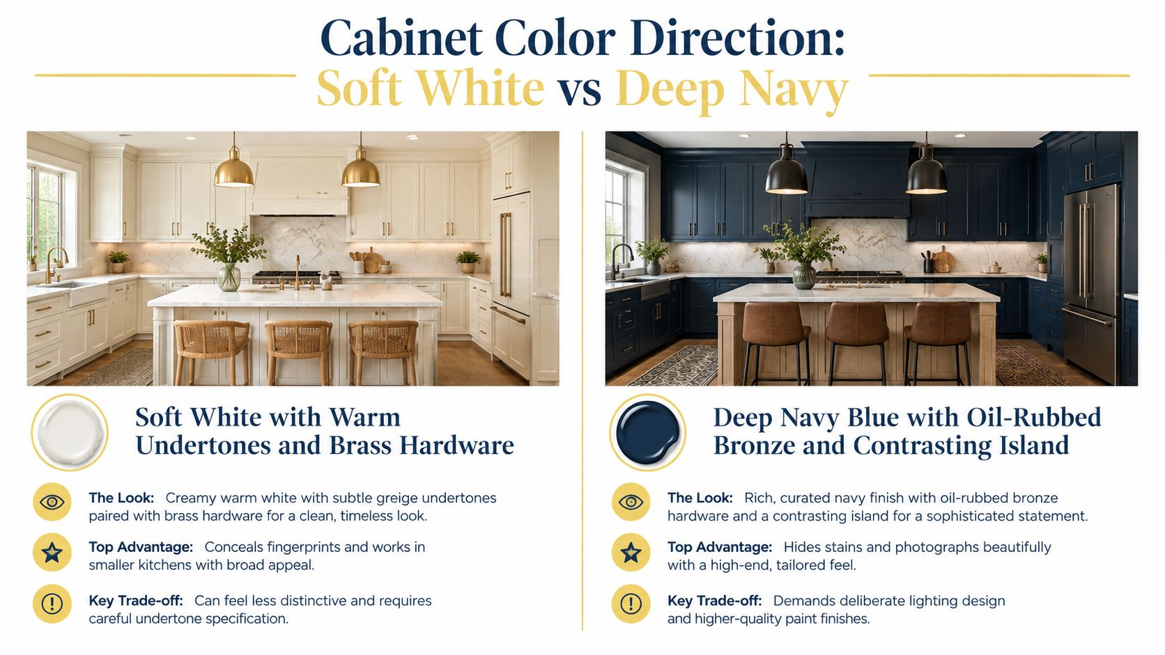
1. Soft White with Warm Undertones and Brass Hardware
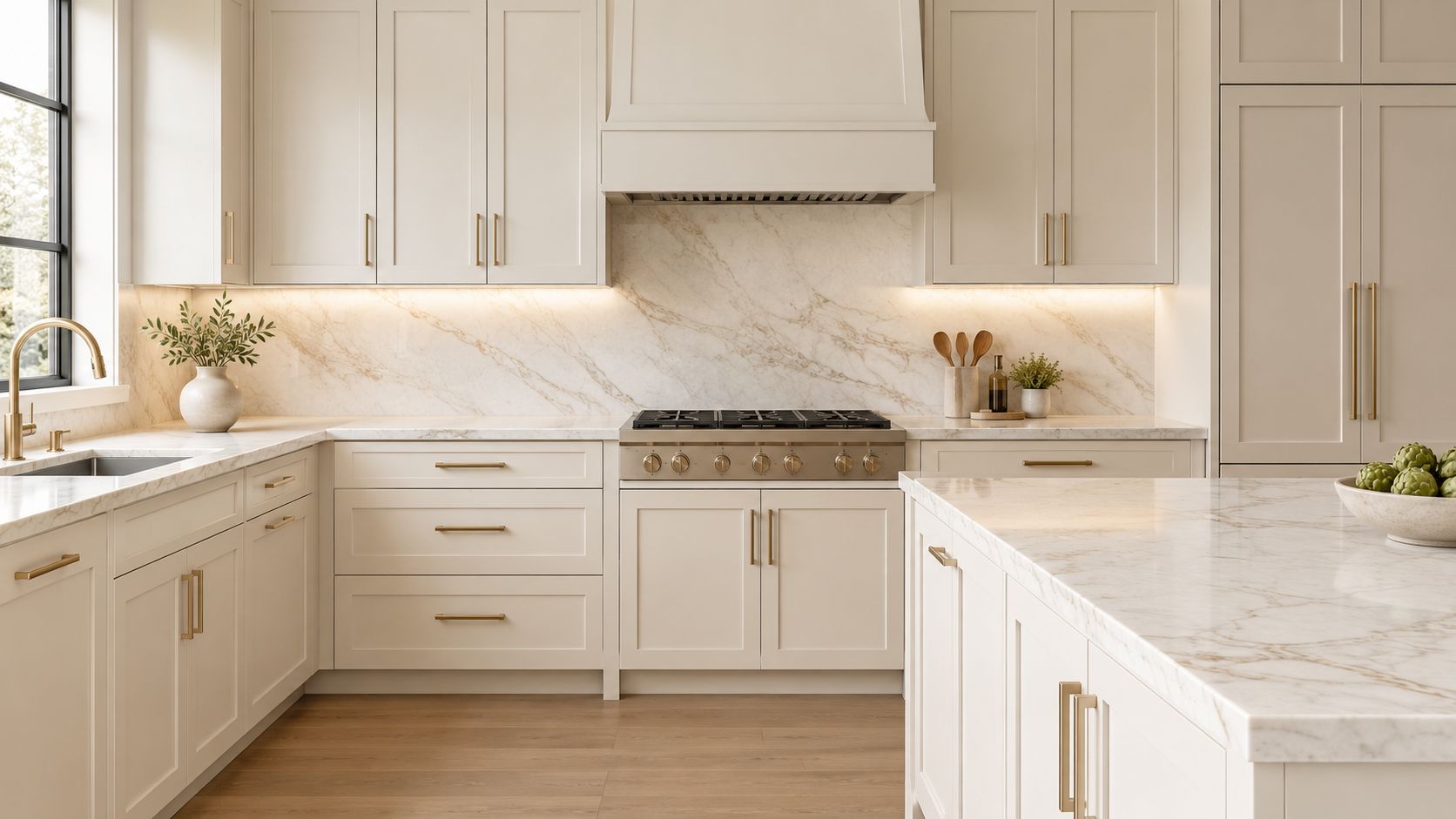
Soft white cabinetry creates a calm foundation, but the undertone determines whether the result feels welcoming or washed out. A creamy white with just enough warmth to avoid looking stark works particularly well with light marble countertops, restrained backsplash tile, and brass hardware. It should read as clean rather than yellow, giving the room a polished background while allowing stone, lighting, and architectural details to take visual precedence.
A Chevy Chase residence illustrates the balance well, with soft white Shaker cabinets, Calacatta marble counters, and integrated brass bar pulls. In an Easton, Maryland, Colonial Revival kitchen, warm white cabinetry works with custom pantry doors and satin brass hardware to reinforce the home's traditional character without making the room feel overly formal.
Let the light choose the white
Paint samples should be viewed in the actual kitchen, not only under showroom lighting. Morning light, afternoon light, and evening fixtures can reveal very different undertones. A kitchen receiving primarily cool northern light often benefits from a warmer white, while strong southern exposure may support a cleaner, less creamy option.
Practical rule: Specify the exact paint formula with the cabinet maker. A familiar color name doesn't guarantee that two finish systems will match.
Brushed brass offers a quieter, softer effect than polished brass, while polished brass adds more jewelry-like definition. Chrome and stainless steel can work, but they generally cool the composition. For a deeper look at how pulls, knobs, and appliance hardware affect the finished design, explore these kitchen cabinet hardware styles.
2. Deep Navy Blue with Oil-Rubbed Bronze and a Contrasting Island
Deep navy gives cabinetry a deliberate, refined quality. It can feel classic in a Federal-style townhouse, coastal in an Easton waterfront property, or transitional in a Northern Virginia kitchen, depending on the surrounding materials. The color is most successful when the room has enough visual and physical warmth to keep it from feeling heavy.
One Easton kitchen pairs navy perimeter cabinets with a cream island and floral tile backsplash. A DC-area Federal-style townhouse uses navy cabinetry throughout with brass ring pulls and white subway tile, while a Northern Virginia kitchen places navy on the lower cabinets beneath white uppers and finishes the island with a marble waterfall counter.
Use contrast to control visual weight
A lighter island can give a navy perimeter room more complexity without introducing another unrelated color. Warm wood, warm marble, or butcher block counters also help, especially in kitchens where the daylight is limited. Navy shifts dramatically as light changes, so samples belong in the room, beside the countertop, and near the backsplash.
Under-cabinet lighting and overhead ambient lighting should be planned with the cabinetry rather than added at the end. Poorly placed fixtures can flatten navy into a dull blue-black, while layered lighting reveals its depth and protects work surfaces from shadow.
Oil-rubbed bronze reads traditionally and works naturally with raised-panel or historically detailed architecture. Blackened brass feels more contemporary and gives the same dark-metal effect with a sharper edge. The distinction matters because the hardware should reinforce the room's architectural language, not merely match the faucet.
A lighter island is one of the most reliable ways to use navy without making every surface compete for attention.
3. Warm Gray-Green with Matte Black Hardware and Natural Wood Accents
Warm gray-green offers color without demanding that the entire kitchen become decorative. It has enough gray to remain composed, but its green undertone brings a connection to gardens, painted furniture, and natural materials. The finish works especially well when paired with white or light oak shelving, natural wood island details, and quiet black hardware.
In a contemporary Chevy Chase kitchen, gray-green cabinetry sits beside open wooden shelving, white subway tile, and matte black pulls. An Ashburn residence uses gray-green lower cabinets with white upper glazed doors, live-edge wood counters, and mixed-metal hardware. A Maryland farmhouse takes a softer route with gray-green cabinets, honed marble, and natural wood floating shelves.
Keep the green visible
The same gray-green can look elegant in strong daylight and muddy under weak artificial light. View samples in morning, afternoon, and evening conditions, then check them under the actual task lighting. Adequate ambient and task illumination matters because the color's gray component becomes more dominant as the room darkens.
Natural wood makes the green undertone easier to read. White oak shelving, a warm wood island top, or a simple wood stool can give the cabinets a collected quality without creating a rustic theme. Matte or satin black hardware is preferable to glossy black here. It keeps the look understated and avoids introducing another reflective surface.
For the surrounding finishes, white subway tile, light marble, and soft gray quartz create relief. A dark backsplash or heavily patterned stone can make gray-green feel denser than intended, particularly on full-height cabinetry.
- For open shelving: Choose white oak or a pale painted shelf to interrupt broad cabinet runs.
- For hardware: Use matte or satin black rather than high-gloss finishes.
- For lighting: Combine work-focused under-cabinet fixtures with softer overhead illumination.
- For countertops: Keep the surface light enough to preserve the color's quiet character.
4. Soft Greige with Antique Brass and Textured Tile Backsplash
Greige bridges gray and beige, making it useful when a kitchen needs to connect contemporary cabinetry with an older home's trim, flooring, or masonry. Unlike a flat neutral, a well-chosen greige can respond to both warm wood and cooler stone. Its success depends on selecting a shade whose undertone agrees with the backsplash and countertop rather than treating greige as interchangeable from room to room.
A DC Craftsman kitchen pairs soft greige cabinetry with hand-glazed subway tile and antique brass hardware. In Chevy Chase, greige cabinets work with custom ceramic tile in muted tones and aged brass ring pulls. A Maryland farmhouse uses greige perimeter cabinets beside a textured, Moroccan-inspired backsplash and antique brass accents.
Give texture a supporting role
The backsplash should add variation without fighting the cabinet color. Hand-glazed or textured tile can introduce small shifts in tone that make the greige feel intentional. Grout deserves equal attention. A bright, high-contrast grout can outline every tile and make the composition busier, while a coordinated grout lets the tile's surface variation do the work.
Antique brass with visible patina is a practical choice for this palette because it can age gracefully and disguise the small marks that accumulate around frequently used pulls. A warm countertop keeps the cabinet and tile relationship cohesive. Cool white stone may work in a bright room, but it can make the greige appear more beige by comparison.
Greige should be judged beside the tile, not against a blank wall.
Under-cabinet lighting brings warmth into both the cabinet color and the backsplash. Without it, textured tile can lose its depth and the greige may read flat. Jennifer Gilmer Kitchen & Bath's guidance on kitchen backsplash design is useful when coordinating tile scale, grout, lighting, and cabinetry details as one composition.
5. Rich Charcoal with Stainless Steel Hardware and Light Quartz Counters
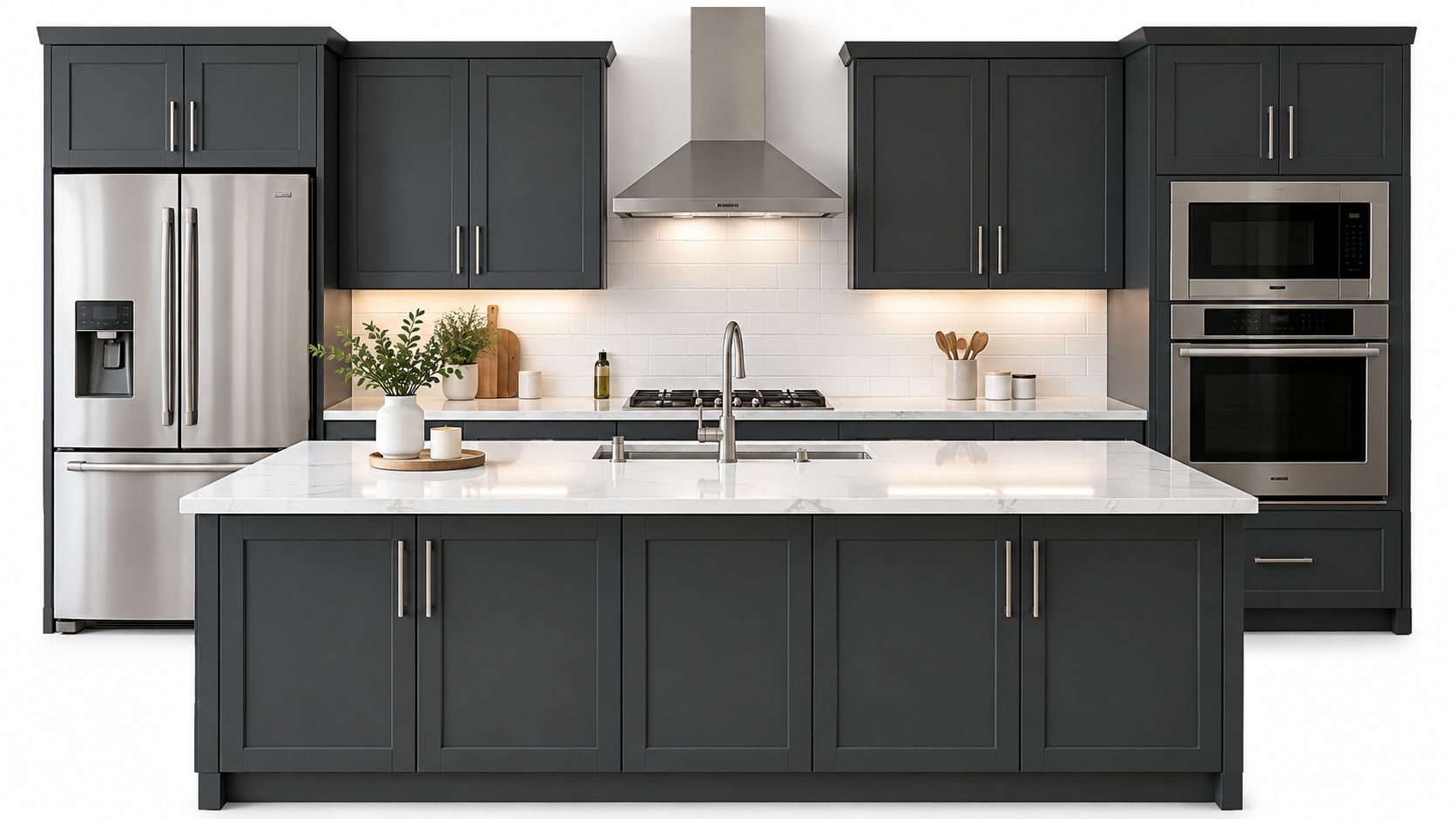
Rich charcoal creates a strong architectural frame, especially in a kitchen with clean-lined doors, contemporary appliances, and carefully controlled contrast. It isn't just black softened with gray. The best charcoal finishes have enough complexity to work beside white quartz, light gray stone, or warm pale surfaces without appearing severe.
An Arlington contemporary kitchen pairs charcoal cabinetry with white quartz counters, stainless steel hardware, and a restrained linear design. A Chevy Chase modern renovation uses charcoal lower cabinets beneath lighter uppers, with integrated stainless steel appliances. In Northern Virginia, a full charcoal kitchen is balanced by light gray quartz counters and brushed nickel hardware.
Lighten the surrounding planes
Charcoal needs a deliberate lighting plan. Under-cabinet task lighting is necessary for work areas, while overhead ambient lighting keeps tall cabinets and corners from disappearing. Natural light should also be considered when deciding whether charcoal belongs on the full perimeter or only on lowers and an island.
Light quartz or marble counters provide visual relief and give the room a brighter working surface. White, light gray, and warm light quartz can all work, but the countertop's undertone should be checked against the cabinet sample. A backsplash in white or a pale tile adds another layer of brightness without forcing the kitchen into a stark black-and-white scheme.
Stainless steel and brushed nickel support the contemporary character more naturally than heavily patinated metals. Their cooler reflectivity can be useful beside charcoal, but the wall color should still provide contrast. If the walls, cabinets, and backsplash all sit in similar dark values, the kitchen can lose definition.
Cabinet sheen also matters. A finish with too much reflectivity can emphasize fingerprints and make the charcoal feel glossy rather than architectural. Review the differences between painted, stained, and textured options in this guide to kitchen cabinet finishes before approving the final specification.
6. Soft Sage Green with Brushed Brass and Terrazzo Accents
Soft sage green brings a nature-inspired note to the kitchen while remaining restrained enough for long-term living. Its character comes from the balance between green and gray. Too much gray can make it lifeless, while a yellow cast may clash with cool stone and bright white finishes.
An Easton residence uses soft sage cabinetry with a terrazzo island countertop, white subway tile, and brushed brass hardware. Another Maryland home combines sage perimeter cabinets with a speckled quartz waterfall island and mixed warm metals. In a DC transitional kitchen, sage cabinets sit beside honed marble and a terrazzo accent island.
Let the island carry the texture
Terrazzo or another aggregate surface is particularly effective on an island because it gives the room a visual focal point without requiring a patterned backsplash across every wall. The speckling can connect sage cabinetry to wood, stone, and hardware, but the colors in the aggregate should be reviewed beside the actual cabinet sample.
Brushed brass adds warmth and can develop a pleasing patina over time. Natural wood shelving or a warm tile backsplash continues that connection to organic materials. Avoid pairing sage with cool whites and overly stark modern finishes unless the contrast is intentional. Those choices can make the green appear disconnected from the rest of the room.
Sample it beside the stone: Sage can look green, gray, or yellow depending on the materials around it.
Lighting is a selection issue, not a finishing detail. View samples under daylight, under-cabinet fixtures, and evening ambient lighting. If the room lacks natural light, use layered illumination to keep the lower cabinets from becoming visually muddy.
The palette works best when the countertop, hardware, and wood tones share warmth. That doesn't mean every finish must match. Mixed metals can add depth, provided the dominant metal and the cabinet undertone remain clear.
7. Classic Inset White with Polished Nickel Hardware and Marble Slab Backsplash
Classic white inset cabinetry shifts attention from paint color to proportion, joinery, and material quality. The inset door sits within the cabinet frame, creating a precise architectural rhythm that suits Colonial, traditional, and transitional homes. With polished nickel hardware and a marble slab backsplash, the result feels enduring because the composition relies on craftsmanship and restraint rather than a passing color direction.
A Chevy Chase Colonial kitchen pairs white inset cabinets with a Calacatta marble slab backsplash, polished nickel hardware, and a light oak island. An Easton traditional home uses white inset cabinetry with a honed marble backsplash and transitional styling. In Northern Virginia, white inset cabinets and marble work with contemporary proportions to keep the room formal but current.
Refine the details around the white
Choose a high-quality cabinet paint finish designed to resist fingerprints and maintain brightness. White cabinetry asks for a realistic cleaning routine, particularly around pulls, sink bases, and frequently used drawers. Marble surfaces also need appropriate care and sealing, so the maintenance expectations should be part of the selection conversation.
Polished nickel hardware should have enough weight to feel intentional against the inset doors. A thin, insubstantial pull can undermine the cabinet detailing, while a substantial knob or bar pull reinforces the furniture-like quality. Marble veining should provide movement without overwhelming the room. A quiet slab often allows the door construction and hardware to remain visible.
- For the island: Use warm light oak to prevent the white perimeter from feeling sterile.
- For the backsplash: Select veining that relates to the room's scale and architectural lines.
- For lighting: Combine natural daylight with supplemental fixtures so white stays dimensional.
- For upkeep: Plan regular cleaning for the cabinet finish and sealed marble surfaces.
White doesn't have to mean flat or generic. Inset construction, thoughtful proportions, a carefully selected marble slab, and substantial polished nickel can make a light kitchen feel highly considered.
7-Option Kitchen Cabinet Color & Finish Comparison
| Style | 🔄 Implementation Complexity | Resource Requirements | ⭐ Expected Outcomes 📊 | Ideal Use Cases | 💡 Tips |
|---|---|---|---|---|---|
| Soft White with Warm Undertones and Brass Hardware | Low–Moderate, straightforward paint + hardware; undertone specification required | Moderate, quality brass pulls, light marble/quartz, paint samples | High, timeless, brightening, broad resale appeal | Small–medium kitchens; clients wanting neutral, flexible backdrop | Request samples in morning/evening; specify exact paint formula; pair with polished/brushed brass |
| Deep Navy Blue with Oil‑Rubbed Bronze and Contrasting Island | High, needs lighting plan, primer/multiple coats, high‑quality finish | High, premium paint, oil‑rubbed bronze hardware, upgraded lighting | High, dramatic, sophisticated, hides wear; strong photographic contrast | Statement kitchens, traditional millwork, two‑tone schemes, larger spaces | Include under‑cabinet lighting; test samples in situ; consider two‑tone island and warm counters |
| Warm Gray‑Green with Matte Black Hardware and Natural Wood Accents | Moderate, careful spec to read green not gray; lighting helps | Moderate, matte black hardware, natural wood shelving/accents, paint samples | Medium–High, calm, collected personality without being trendy | Transitional/contemporary kitchens; clients wanting subtle color with warmth | View samples under varied light; pair with wood to emphasize green; use matte/satin black hardware |
| Soft Greige with Antique Brass and Textured Tile Backsplash | Moderate, undertone and tile coordination essential; may need primer | Moderate, antique brass, textured tile backsplash, quality paint | Medium–High, sophisticated, collected look driven by texture and material depth | Transitional, farmhouse, or homes with mixed architectural details | Test greige samples in different light; choose patinated antique brass; coordinate grout and tile tones |
| Rich Charcoal with Stainless Steel Hardware and Light Quartz Counters | Moderate–High, requires intentional lighting and material contrast planning | Moderate–High, light quartz/marble counters, stainless/brushed nickel hardware, task lighting | High, dramatic contemporary contrast; strong zone definition and modern appeal | Open‑concept and architect‑designed kitchens; clients seeking contemporary drama | Integrate under‑cabinet and ambient lighting; select light counters/backplash for visual relief |
| Soft Sage Green with Brushed Brass and Terrazzo Accents | Moderate, specify muted sage undertone carefully; coordinate materials | Moderate, brushed brass, terrazzo or speckled accents, quality paint | Medium–High, refined, nature‑inspired warmth without being theme‑driven | Transitional and nature‑inspired kitchens; islands that showcase terrazzo accents | Sample paint in situ; ensure sage reads green not yellow; use terrazzo on island for texture |
| Classic Inset White with Polished Nickel Hardware and Marble Slab Backsplash | High, inset carpentry, marble slab installation, meticulous finishing | High, inset cabinetry, polished nickel hardware, marble slab, premium paint | Very High, timeless, architectural, high perceived value and longevity | High‑end traditional/transitional projects; clients prioritizing enduring quality | Invest in durable, low‑mark paint; choose subtle marble veining; plan cleaning/maintenance routine |
Turn a Favorite Palette into a Finished Plan
A cabinet color becomes convincing only after it survives contact with the rest of the kitchen. Compare samples directly against the countertop, backsplash, flooring, trim, and any wood you plan to keep. A color that looks balanced on a white board may shift noticeably beside Calacatta marble, honed gray stone, terrazzo, or warm oak.
View the samples in morning and evening light, then check them with the intended under-cabinet and overhead fixtures. This is especially important for navy, gray-green, greige, and sage, where the balance between warm and cool undertones can change across the day. If the room receives mostly northern light, a warmer neutral may feel more inviting. If the room receives abundant daylight, a cleaner white or deeper color may hold its character more confidently.
Hardware and lighting should be coordinated before the cabinet order is finalized. Brass, bronze, polished nickel, stainless steel, and black each change the perceived temperature of the cabinetry. The same applies to sheen. Matte, satin, honed, polished, and textured surfaces can make a color feel softer, sharper, older, or more contemporary.
Confirm the finish system and exact paint formula with the cabinet maker. Painted cabinetry is not only about the color chip. Door construction, edge details, sheen, application method, and touch-up procedures all affect the finished appearance and long-term maintenance.
For homeowners in Washington, DC, Maryland, Virginia, and Delaware, Jennifer Gilmer Kitchen & Bath offers a practical setting for making these decisions. Clients can visit the Chevy Chase, Easton, or Ashburn showroom to compare cabinetry, hardware, countertop materials, backsplash options, and lighting ideas in person. The firm's process connects layout planning, storage, appliance placement, material selection, and installation coordination, so a promising cabinet color can become part of a coherent plan rather than an isolated choice.
A showroom consultation is particularly helpful when the kitchen must respect existing architecture. A soft white may suit a Colonial interior, while charcoal or navy may better support a contemporary renovation. Greige, sage, and gray-green can bridge old and new when the tile, flooring, and hardware are selected with equal care.
Bring photographs of the room, countertop samples if available, flooring information, and notes about how the kitchen is used. Jennifer Gilmer Kitchen & Bath can then help evaluate color in the context of the full project, from the first concept through detailed selections and installation.
Jennifer Gilmer Kitchen & Bath offers showroom-based guidance on cabinetry, color, hardware, lighting, layout, and material coordination for kitchens in Washington, DC, Maryland, Virginia, and Delaware. Visit Jennifer Gilmer Kitchen & Bath to arrange a consultation in Chevy Chase, Easton, or Ashburn and turn your preferred cabinet palette into a complete remodeling plan.