.avif)

Early in the morning, a kitchen wall can read as soft gray. By noon, it may turn warm cream, and under pendant lights at dusk, the same paint can go flat. Before choosing among great paint colors for kitchens, test every candidate in the light your kitchen receives, beside the materials that will stay.
The examples below draw on kitchens in the Washington, DC, Maryland, and Virginia area. Each pairs a wall color with cabinetry, countertops, lighting, and finishes that help it work, along with the undertone trade-offs that can change the result. Jennifer Gilmer Kitchen & Bath handles projects from concept through installation, so color decisions can be considered alongside layout, lighting, hardware, and ventilation. For households also thinking about air quality during a remodel, a practical resource on kitchen air purifiers may be useful.
Table of Contents
1. Warm White with Soft Undertones
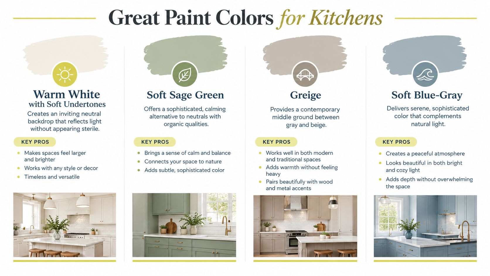
Warm white remains the most forgiving starting point for a kitchen, particularly when the room already has visual activity. In the 2026 U.S. Houzz Kitchen Trends Study, off-white appeared as the most common wall color in renovated kitchens at 29%, followed by white at 21%. Those choices don't make warm white mandatory, but they do show why it continues to feel comfortable in real homes.
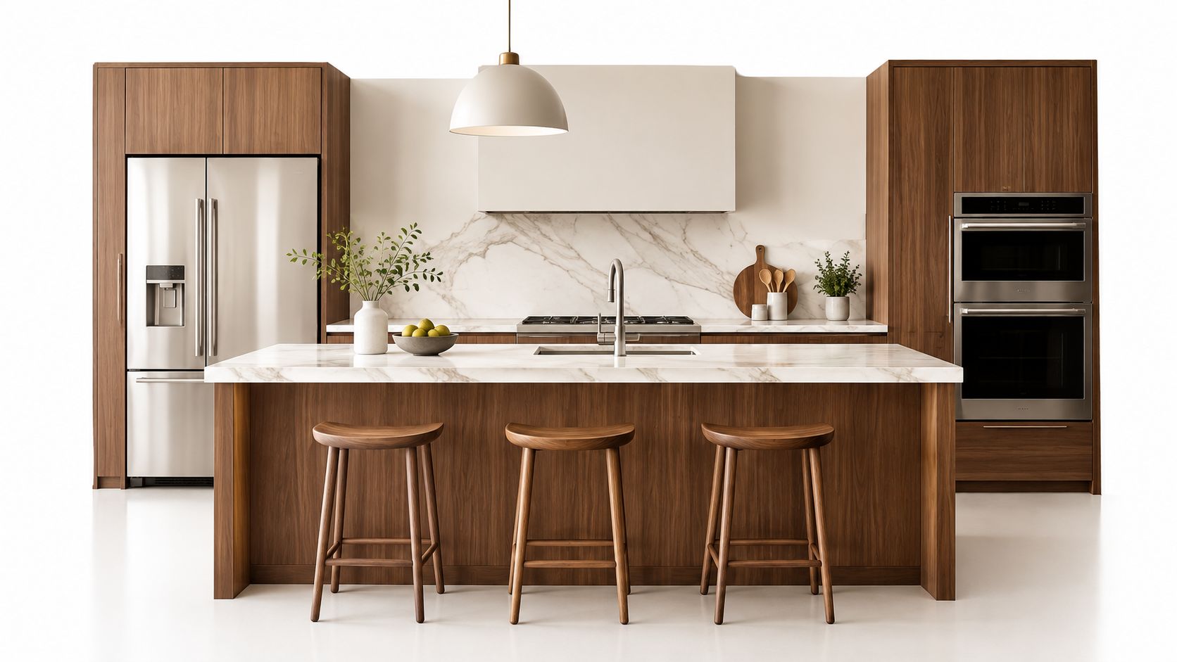
In a Chevy Chase kitchen, Benjamin Moore Swiss Coffee creates a quiet background for rich walnut cabinetry and marble countertops. The slight warmth keeps the marble from reading icy and lets the walnut carry the room's depth. Sherwin-Williams Alabaster offers a similar approach in a transitional Easton kitchen, where mixed metallics need a wall color that won't compete with brass, polished nickel, or aged bronze.
The undertone decision
A white with a barely perceptible yellow, beige, or gray undertone can adapt gracefully as daylight shifts. A stark blue-white may look clean in a bright south-facing room but cold beside creamy cabinetry or warm stone. Conversely, a strongly yellow white can make pale countertops look dingy under warm evening bulbs.
Practical rule: Place the sample beside the countertop, cabinet door, backsplash, and flooring. A white that looks neutral on a paint card may reveal its undertone immediately against marble or walnut.
Use warm white across all four walls when cohesion matters. Satin or semi-gloss makes sense in cooking zones where walls need regular wiping, although the exact sheen should follow the product and surface preparation. For more guidance on coordinating wall color with cabinetry, see these paint color ideas for kitchen cabinets.
2. Soft Sage Green
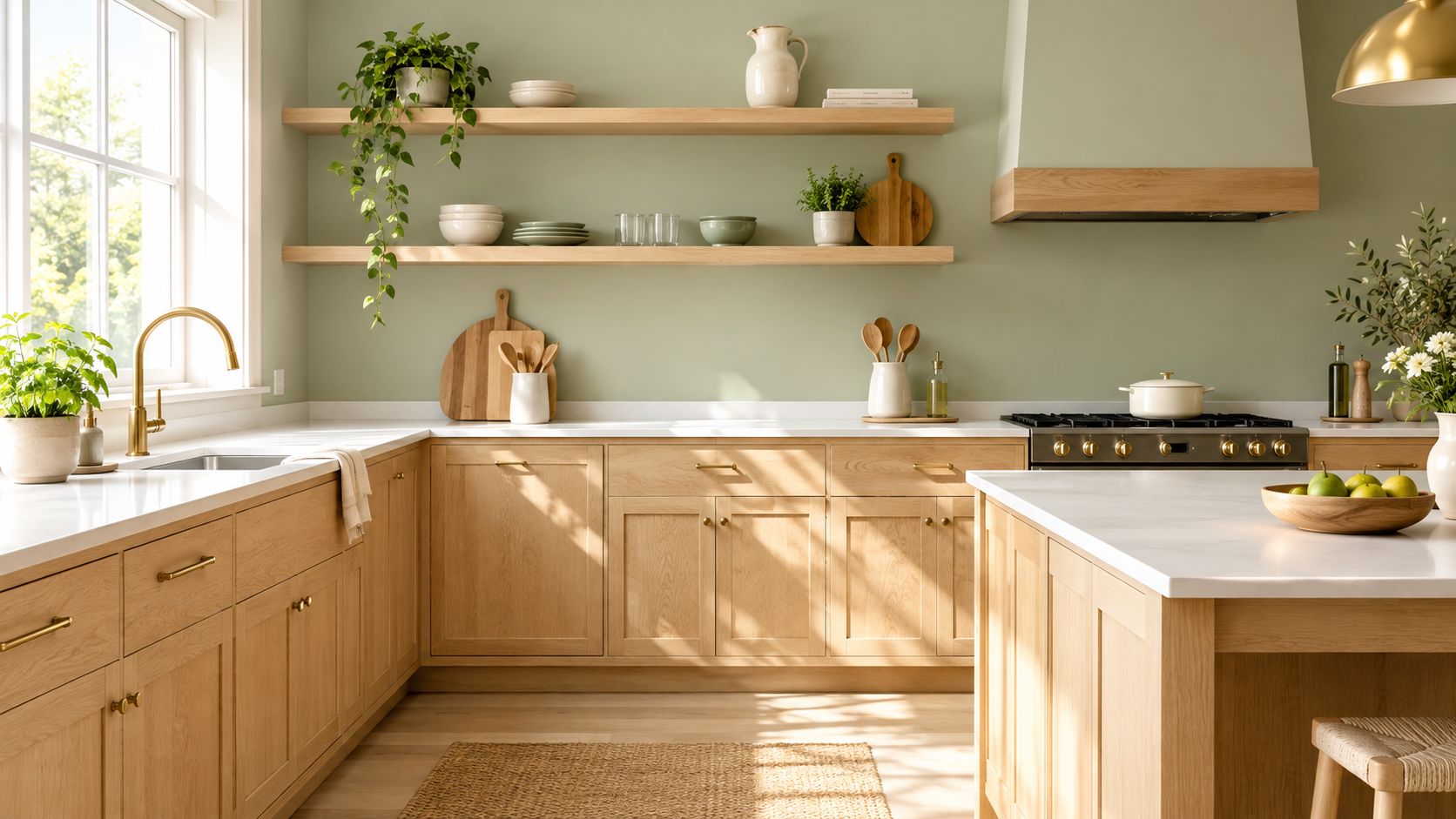
Soft sage gives a kitchen color without the visual force of a saturated green. Its gray component quiets the hue, while its natural reference works comfortably with painted cabinetry, oak, stone, and unlacquered brass. That balance is why sage can feel considered rather than merely fashionable.
Farrow & Ball Vert de Terre suits a Maryland kitchen with traditional painted cabinetry and brass hardware. Its muted character supports the hardware's warmth without making the room feel themed. In a contemporary Ashburn kitchen with light oak and stainless steel, Sherwin-Williams Sea Salt takes a cooler, more restrained route, allowing the wood grain and metal finishes to remain prominent.
Green changes quickly in context
Sage with a green undertone can look fresh beside warm white cabinetry, but it may become yellow or muddy beside a yellow-beige countertop. A gray-forward sage can appear refined beside cool stone, yet lifeless beside a warm wood floor. North-facing light can pull the gray forward, while warm evening LEDs may emphasize its yellow or green notes.
The difference between a successful sage and an unsettled one often comes down to the fixed finishes. Test a large sample beside the actual counter, not a generic white board, and leave it in place through morning and evening.
- Traditional pairing: Use brass or bronze when the kitchen has painted cabinetry, framed doors, and classic detailing.
- Contemporary pairing: Cool metals and stainless steel can sharpen a gray-green sage in a cleaner-lined room.
- Surface choice: Eggshell or satin generally gives a cooking area a more practical, wipeable finish than a very flat surface, subject to the product specification.
A 2025 NKBA kitchen trends report identified green as a leading color preference among its respondents. That popularity makes testing more important, not less. The right sage is the one that works with your room's light and materials, not the one that appears most often in inspiration images.
3. Greige with a Gray-Beige Balance
Greige is useful when a kitchen needs more depth than white but less contrast than a true gray. The gray component keeps it current and composed, while the beige component prevents the walls from feeling austere. In an open-plan home, that middle ground can also help the kitchen connect with adjacent living spaces.
Benjamin Moore Nimbus Gray works with white shaker cabinets and terrazzo countertops in a Virginia kitchen because it gives the wall enough weight to organize the varied surface. The color doesn't compete with the terrazzo's pattern, but it doesn't disappear beside the white cabinetry either. For a more dramatic application, a lighter treatment of Sherwin-Williams Urbane Bronze can define an accent wall in an open-plan kitchen remodel.
Choose the direction of the blend
Not every greige is neutral in the same way. A gray-forward version suits clean-lined cabinetry, polished stone, and restrained hardware. A beige-forward version feels more at home with natural oak, aged metals, and traditional or transitional detailing.
Greige can also expose undertones in surrounding materials. A countertop with pink or mauve movement may make a warm greige look rosy. A green-gray floor can push the wall toward olive. This isn't a flaw in the paint, but it can be a mismatch if the room needs a simple backdrop.
Paint the main walls in one greige and reserve white for the ceiling and trim when you want architectural edges to remain clear. Natural wood open shelving adds relief and keeps a predominantly neutral room from feeling sterile. In a kitchen visible from a family room, carrying the greige toward the adjacent sightline can make the entire floor feel more settled.
The best test includes flooring, because the wall and floor meet in the viewer's peripheral vision. A color that works against a cabinet door may still look wrong above a red-toned oak floor or a cool porcelain tile.
4. Soft Blue-Gray with Coastal Influence
Soft blue-gray offers color with restraint. It can feel serene beside water views, bright windows, or pale cabinetry, but its success depends on keeping the room from becoming visually cold. The most useful versions sit between blue and gray, with enough gray to behave like a neutral and enough blue to give the walls character.
In a Chesapeake-area kitchen overlooking water, Farrow & Ball Parting Tone can echo the surroundings without turning the room into a literal coastal scheme. Light wood and warm countertops keep the color approachable. In a Northern Virginia remodel, a diluted application of Benjamin Moore Hale Navy creates a deeper blue-gray backdrop, particularly effective behind open shelving or against light cabinetry.
Light and warmth keep blue in balance
Blue-gray is at its best when the kitchen has windows or skylights that let the color interact with daylight. In a dim room, the gray may dominate and make the walls feel heavy. Under cool lamps, the blue can become sharper; under warm lamps, it may appear more muted or slightly green depending on the surrounding finishes.
Warm metals are reliable partners. Brass and copper keep the palette from feeling clinical, while pale oak introduces a softer transition between wall and floor. A warm-colored countertop can do the same work, especially if it contains cream, tan, or subtle rust movement.
Use matte or eggshell when you want the color to remain calm. High reflectivity can intensify a blue-gray and make every shift in light more visible. A large sample should be viewed beside the backsplash and countertop at different times of day, because the same paint may look almost gray in the morning and distinctly blue at dusk.
Blue has also held a durable role in kitchen accents. Earlier Houzz kitchen trend data recorded blue as the leading contrasting island color in its historical survey milestones. That supports using blue deliberately, whether on the wall, island, or a smaller architectural element, rather than assuming the entire kitchen needs a strong blue envelope.
5. Deep Charcoal or Navy with Strategic Lighting
Dark walls can give a kitchen intimacy and architectural definition, but they aren't a shortcut to drama. They need a lighting plan that keeps work surfaces legible and prevents the room from feeling enclosed. The color should be chosen alongside the lighting, not after it.
Farrow & Ball Railings works in a modern Maryland kitchen with white cabinetry, marble counters, recessed lighting, and pendants. The dark wall makes the pale stone and cabinetry appear cleaner, while the layered lighting breaks up the depth. In a Washington, DC, kitchen, Benjamin Moore Charcoal Blue can create a backdrop for open shelving when integrated lighting is directed toward the displayed objects and work areas.
Light the room before committing to the wall
A dark kitchen usually needs several kinds of light. Recessed fixtures support general illumination, pendants establish a visual focus over an island, and under-cabinet lighting handles task areas. Windows and skylights help, but their contribution changes with weather and season.
Dark paint works when the room has enough light to show its texture, materials, and work surfaces. Without that support, navy can read black and charcoal can flatten the details that give a kitchen character.
Pair dark walls with light cabinetry or countertops to maintain visual balance. White marble, pale quartzite, painted cabinets, and light oak can all create useful contrast. Eggshell or satin offers some cleanability and a controlled reflection, while a very glossy finish may highlight wall irregularities and make the color feel more forceful.
Before painting, review the fixture locations, switching, color temperature, and under-cabinet coverage with the design team. Jennifer Gilmer Kitchen & Bath considers those relationships as part of kitchen lighting fixture planning, rather than treating paint as an isolated final decision.
A dark color can also make practical flaws more visible. Grease marks, uneven patches, and poorly finished drywall may show against a deep surface, so preparation matters as much as the paint selection.
6. Warm Taupe with Subtle Earthiness
Warm taupe earns its place in kitchens that already have something real to work with. A run of walnut cabinets, a slate backsplash, limestone counters, clay tile underfoot. In those rooms, taupe acts less like a feature color and more like the tone that settles everything into one palette.
Sherwin-Williams Accessible Beige, used on the warmer side, suits a traditional kitchen with wood cabinetry and slate because it picks up the brown cast in both materials without turning flat. Benjamin Moore Balanced Beige can work in a transitional Virginia kitchen with natural stone countertops and warm wood tones, where a cooler gray would make the room feel a little distant. The decision usually comes down to undertone. If the stone reads smoky or mineral, a grayer taupe can make sense. If the cabinets, flooring, or counters carry honey, caramel, or rust notes, a warmer taupe is the safer choice.
Avoid the pink or gray surprise
Taupe is one of the easiest neutrals to misread from a small chip. Beige-leaning versions can flash pink next to red oak, rosy granite, or terracotta flooring. Gray-leaning versions can turn tired under warm bulbs or beside yellow-toned wood. Kitchens magnify that problem because the wall color is surrounded by large fixed surfaces, and each one pushes the paint in a different direction.
That is why I like to judge taupe in the actual room, against the cabinetry, countertop, and backsplash at the same time.
Choose a taupe with warm undertones when the goal is softness and an earthy, lived-in finish. Natural wood shelving, bronze hardware, unlacquered brass, and warm metal pendants all help that direction feel intentional. If the backsplash includes slate, limestone, handmade tile, or clay tones, taupe often gives a quieter transition than white and keeps the room from feeling too sharp.
Finish matters here as much as undertone. Because taupe sits between beige and gray, confirm the sheen on a painted sample board instead of trusting the chip alone. Matte can look beautifully chalky and natural, but satin or eggshell may suit walls that need regular wiping near prep zones. On a warm neutral, that sheen shift can make the color read creamier, cooler, or slightly flatter, so test both color and finish before you commit.
7. Soft Yellow-White with a Brightness Strategy
Pale cream is a good choice for homeowners who want brightness without the severity of a pure white. It brings a slight warmth to kitchens with moderate or variable daylight, making the room feel more welcoming without turning the walls obviously yellow.
Benjamin Moore Linen White works in a traditional Maryland kitchen with cherry cabinetry and granite counters because it relates to the wood's warmth. Sherwin-Williams Alabaster, applied with a warm reading, can support a farmhouse-influenced kitchen with white cabinetry while keeping the overall palette softer than a crisp blue-white.
Compare the cream with every white nearby
The most important test is against trim and cabinetry. A barely warm cream can look elegant beside a neutral white, but an obvious yellow undertone may make white cabinets appear gray or dirty. Cool metal hardware can also feel disconnected when the wall color is strongly warm, so brushed brass, bronze, or a softer nickel may create a more coherent relationship.
Cream is particularly useful when daylight is inconsistent. It can add vitality in a room that otherwise feels subdued, but it shouldn't be asked to correct a fundamentally dark space. Lighting still needs to support the work surfaces, and the backsplash should be checked for undertones that might pull the cream toward peach or yellow.
- For traditional rooms: Pair pale cream with cherry, painted furniture-style cabinetry, granite, and warm metals.
- For farmhouse rooms: Use it with white cabinetry, natural wood, and restrained hardware rather than highly yellow accents.
- For durability: Semi-gloss or satin can make sense where walls need regular cleaning, provided the chosen product is appropriate for the surface.
A review of food-color research found that warm hues such as red and yellow have often been associated with greater perceived pleasure and appetite, while blue may create suppression or aversion in some contexts. A separate study found that colored food images were associated with lower willingness to eat than original images, which shows why color effects aren't universal. In a kitchen, pale cream can offer warmth without making the room feel theatrically tied to a claim about appetite.
8. Muted Terracotta or Warm Clay as an Accent
Muted terracotta brings a kitchen an artisanal, grounded quality, but it needs restraint. The most successful versions are softened and desaturated, closer to clay or sun-warmed plaster than bright brick red. Used on every wall, even a gentle terracotta can dominate cabinetry, counters, and adjoining rooms.
An Easton kitchen with Mediterranean influence can use muted terracotta behind open shelving, where the color becomes part of the display rather than an uninterrupted envelope. In a transitional kitchen combining modern cabinetry with a warm accent, a soft clay tone can define the cooking zone without making the entire room feel themed.
Let the accent have a clear reason
An accent wall works best when it marks a meaningful architectural or functional area. The wall behind open shelves, the cooking zone, or the entry view can all provide a natural stopping point. The remaining walls should usually stay within a related neutral family, such as cream, warm white, or greige.
Countertops and backsplashes need close attention. A clay wall beside a cool blue-gray stone may look disconnected, while one beside limestone, warm marble, handmade tile, or wood can feel integrated. The undertone should also be tested against the flooring, especially if the floor contains red or orange wood notes.
Use a single large sample before deciding. Small paint chips tend to make warm earth colors look simpler than they are. View the color under daylight and artificial light, then consider whether the adjacent rooms can accept the same warmth.
For kitchens with a strong material story, a restrained accent may be more effective than a fashionable whole-room color. Jennifer Gilmer Kitchen & Bath's guidance on colorful kitchen designs reflects that broader principle, color should support the architecture, cabinetry, and daily experience rather than compete with them.
Top 8 Kitchen Paint Color Comparison
| Option | Complexity 🔄 | Resource needs ⚡ | Expected outcome ⭐📊 | Ideal use cases | Key advantages 💡 |
|---|---|---|---|---|---|
| Warm White with Soft Undertones | Low 🔄, straightforward prep and testing | Moderate ⚡, quality semi‑gloss/satin paint; occasional refresh | ⭐⭐⭐⭐, timeless, bright backdrop that adapts to light | Neutral canvas; resale‑focused or variable daylight kitchens | Reflects light without coldness; pairs broadly; hides minor wear |
| Soft Sage Green | Medium 🔄, careful shade testing to avoid unwanted undertones | Moderate ⚡, may need primer/extra coats on dark bases | ⭐⭐⭐⭐, calm, sophisticated color that reads intentional | Clients wanting subtle color; works in limited light & mixed materials | Organic, bridging neutral and color; photographs well |
| Greige (Gray‑Beige Blend) | Medium 🔄, compare undertones across brands | Low‑Moderate ⚡, standard paint + sample testing | ⭐⭐⭐⭐, versatile, stabilizing backdrop for open plans | Open‑concept kitchens; transitional or modern interiors | Balances warm/cool; supports varied cabinetry and materials |
| Soft Blue‑Gray (Coastal Influence) | Medium 🔄, select undertone to avoid green/purple cast | Moderate ⚡, best in well‑lit spaces; pair with warm metals | ⭐⭐⭐⭐, serene, refined color that enhances natural light | Coastal, contemporary, or light‑filled kitchens | Calming, adaptable to warm or cool palettes; elegant presence |
| Deep Charcoal or Navy with Strategic Lighting | High 🔄, requires lighting plan and surface prep | High ⚡, high‑quality paint, layered artificial lighting, design coordination | ⭐⭐⭐⭐, dramatic, high‑impact result when executed well | Large or well‑lit kitchens; clients seeking bold, modern statements | Creates contrast and drama; hides marks; makes light elements pop |
| Warm Taupe with Subtle Earthiness | Low‑Medium 🔄, choose warm (not muddy) undertones | Low‑Moderate ⚡, standard paint; benefits from natural materials | ⭐⭐⭐⭐, grounded, warm backdrop that reads collected | Kitchens with stone, wood, or organic material palettes | Earthy warmth without feeling dated; complements natural finishes |
| Soft Yellow‑White (Pale Cream) with Brightness Strategy | Low 🔄, simple to apply; test against trim/white | Moderate ⚡, quality formula to prevent yellowing; satin/semi‑gloss | ⭐⭐⭐⭐, luminous, welcoming result that feels classic | Variable‑light kitchens; traditional and farmhouse styles | Brightens without starkness; highly versatile with cabinetry choices |
| Muted Terracotta or Warm Clay (Accent Wall) | Medium‑High 🔄, restraint and coordination required | Low‑Moderate ⚡, limited to accent area; careful color matching | ⭐⭐⭐, distinctive focal impact without overwhelming the room | Accent behind shelf/cooking zone; Mediterranean or eclectic narratives | Adds artisanal warmth and focal interest while preserving flexibility |
Testing Your Shortlist Before the Brush Comes Out
Narrow the choice to two or three candidates, then order large samples or paint substantial sample boards. Place each one beside the actual cabinetry, countertop, backsplash, flooring, and hardware. A color that looks balanced against a white paper sample may shift dramatically beside walnut, cherry, green stone, terrazzo, or a warm oak floor.
View the samples in morning light, midday light, and after dark. North-facing windows can make a neutral appear cooler or grayer, while strong southern exposure may bring out yellow or beige undertones. East-facing rooms often change noticeably between morning and afternoon, and west-facing rooms can become warmer as the day ends. Warm LED bulbs may pull cream toward yellow and make blue-gray appear more muted or green.
Don't judge only from the center of a wall. Move the sample near the backsplash, under the cabinets, beside the trim, and close to the floor. The wall color needs to hold its own in the places where shadows, reflections, and neighboring finishes are strongest.
A paint chip tells you what the color is called. The room tells you what the color does.
Durability and indoor air quality belong in the final decision. Kitchen walls encounter cooking moisture, grease, fingerprints, and frequent wiping, so the finish should match the surface and expected use. The EPA's guidance for indoor air quality recommends considering low- or zero-VOC products, providing plenty of fresh-air ventilation, and following product directions. Freshly applied finishes release the highest levels of VOCs during application and curing, so households with children or respiratory sensitivities should plan ventilation and cure time carefully.
Paint also needs to be sequenced with the remodel. Wall work may happen before cabinetry installation, while final touch-ups often follow counters, backsplash, trim, and hardware. Coordinating those stages reduces damage to finished surfaces and gives the final color a better chance of looking intentional.
Jennifer Gilmer Kitchen & Bath works with clients from concept through installation. The firm's showrooms in Chevy Chase, MD, Easton, MD, and Ashburn, VA give homeowners in Washington, DC, Maryland, and Virginia a place to review cabinetry, counters, hardware, and finish relationships in person. By-appointment consultations can help narrow a palette before ordering materials, scheduling painters, or beginning to plan your 2026 remodel budget.
A good kitchen color doesn't exist in isolation. It supports the room's light, makes sense beside the fixed finishes, and remains comfortable through ordinary mornings, busy cooking, and evening gatherings. If a sample only works under one lamp or from one angle, keep testing. The right choice usually feels less like a dramatic discovery and more like the room has finally become coherent.
Jennifer Gilmer Kitchen & Bath helps homeowners in Washington, DC, Maryland, Virginia, and Delaware coordinate kitchen layouts, cabinetry, lighting, materials, and paint from concept through installation. Visit Jennifer Gilmer Kitchen & Bath to explore the firm's showrooms, design consultations, and full-service remodeling approach.